

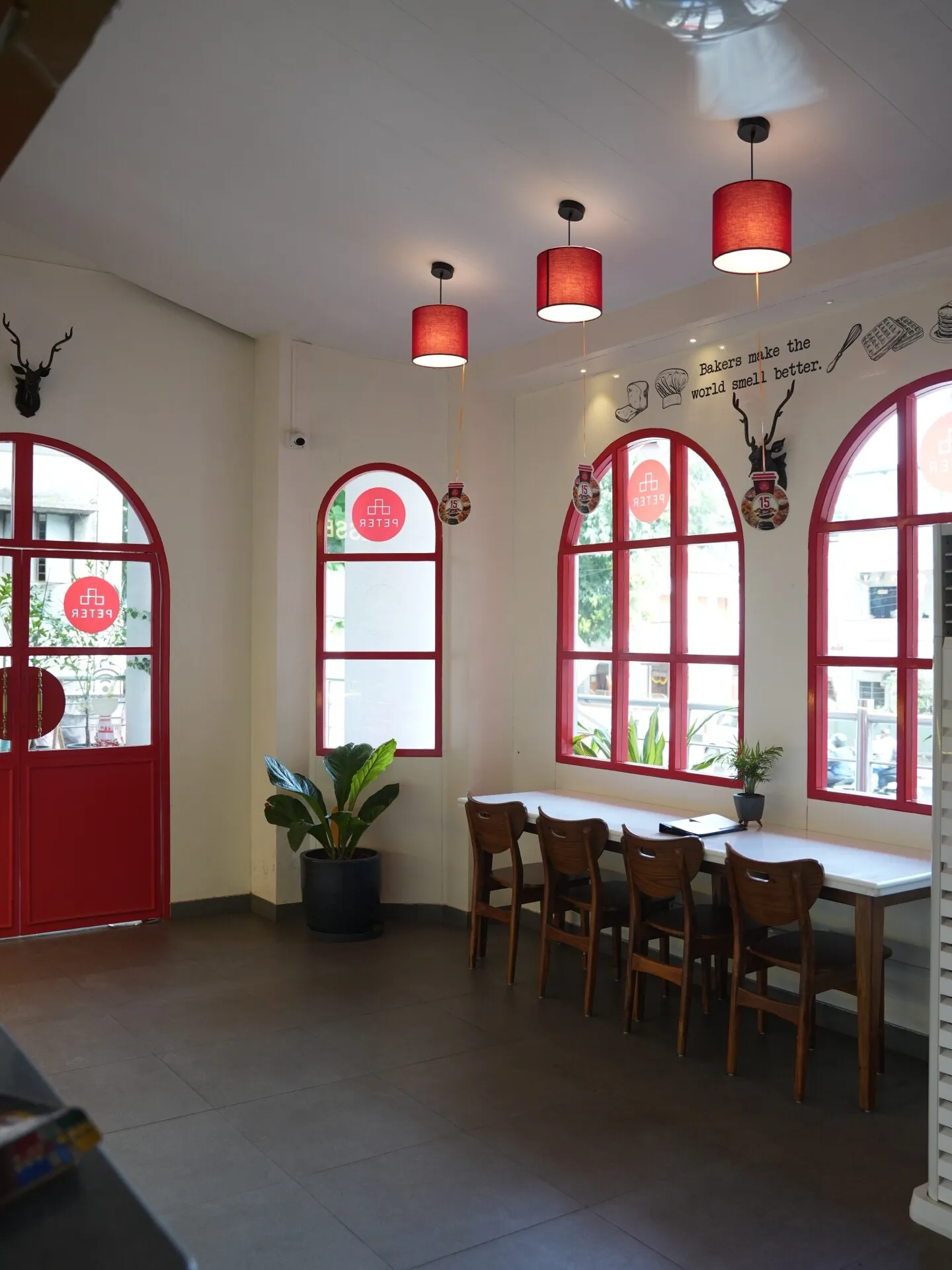
Café Peter, Erandwane
A compact hospitality interior in Erandwane, Pune, where red-framed arches, warm light, planting, seating, and the service counter form one recognisable spatial language.
A compact cafe with a clear visual language
Café Peter is a compact cafe on a lane in Erandwane, Pune. Its first visual cue is straightforward and strong: a series of arched windows with red-painted frames facing the street. The windows are not an isolated facade detail. They establish the shape, colour, and scale that continue inside the cafe.
That continuity makes the interior easy to read. The eye meets the red arch at the street, then finds the same geometry in the internal openings and seating recesses. In a small hospitality space, this kind of consistency matters because there are fewer surfaces and fewer moments to communicate character. A clear visual language allows the room to feel considered without needing many unrelated gestures.
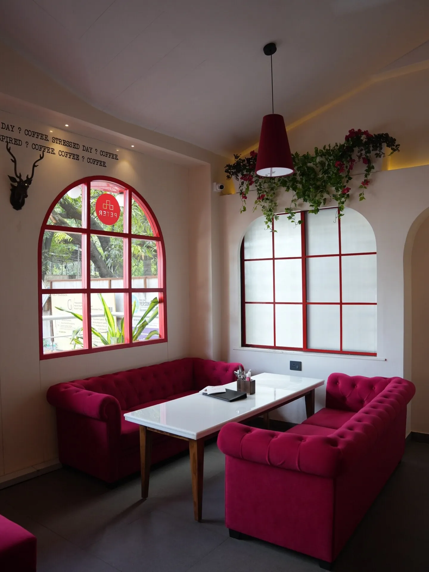
From the street-facing windows to the interior openings
The visible sequence begins outside. The street-facing windows bring daylight into the room and give the cafe a recognisable public edge. Once inside, arched openings divide the seating areas without making the space feel cut into separate rooms. They create a rhythm of thresholds: a visitor sees one opening, then another, then a seating condition within the next bay.
The repeated frame also gives the wall plane a measured pace. Rather than treating every part of the room as a new composition, the project lets one shape return. This is a useful lesson for compact cafes: repetition can do the work of orientation, identity, and visual order at the same time.
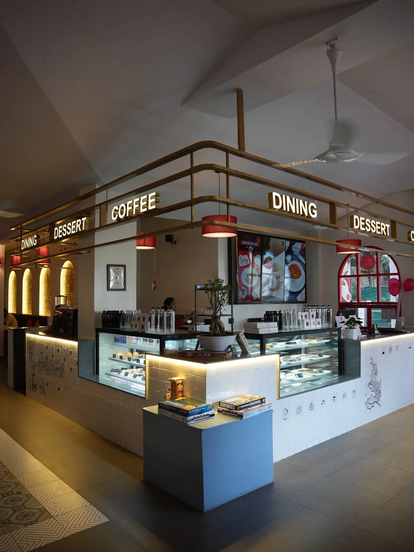
Repetition gives the room its rhythm
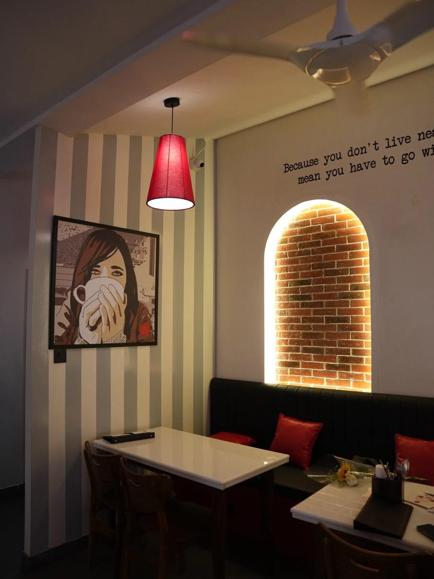
The red frames are the most obvious repeated element, but their effect is supported by the way the room places furniture and light around them. Dining tables and chairs occupy the main zone, while a curved sofa bay sits inside one of the arched recesses. The furniture does not erase the openings; it makes them occupiable.
The geometry therefore works at two scales. From a distance, it reads as a sequence across the room. From a seat, it becomes a smaller enclosure around a table or sofa. The same visual idea can be read as architecture, interior framing, and a place to pause. That layered reading gives a compact cafe more depth than its footprint alone would suggest.
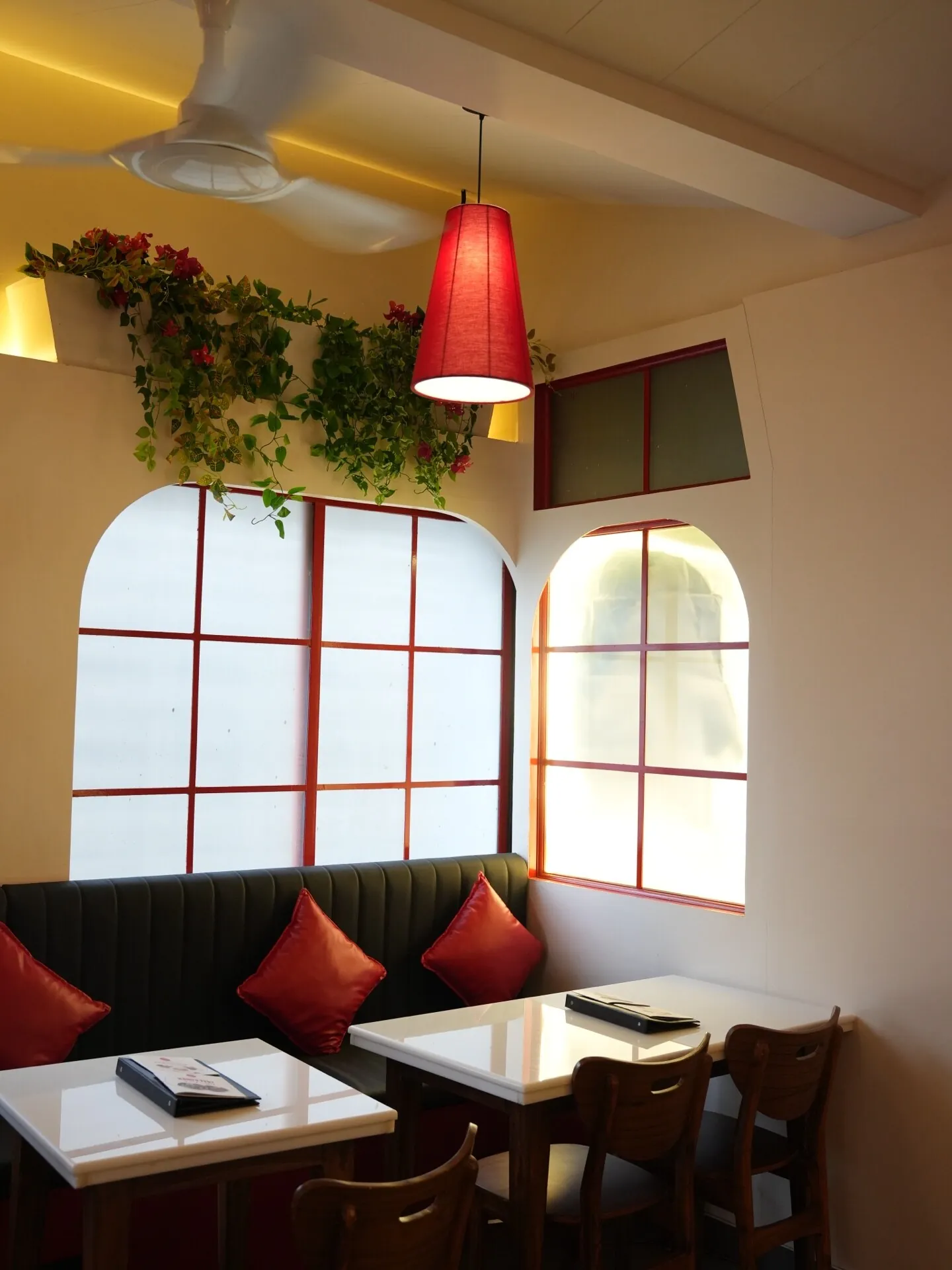
Warm light and planting soften the geometry
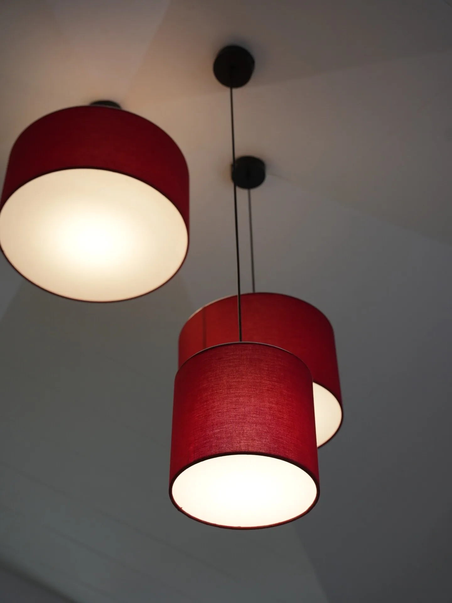
The red frames have a firm, graphic presence. Against them, the warm pendant lights introduce a softer register. Cylindrical red shades hang above the dining areas, repeating the accent colour while diffusing the light into a warmer atmosphere. The result is not a room of hard outlines; the strong frame is balanced by glow, shadow, and the quieter surfaces around it.
A planting shelf runs along the upper part of one wall, holding potted plants above the seating level. It creates a horizontal green line that sits between the ceiling and the furniture. Together, the light and planting keep the repeated arches from becoming purely graphic. They add softness and variation while leaving the main spatial language intact.
Seating, counter, and movement in one compact plan
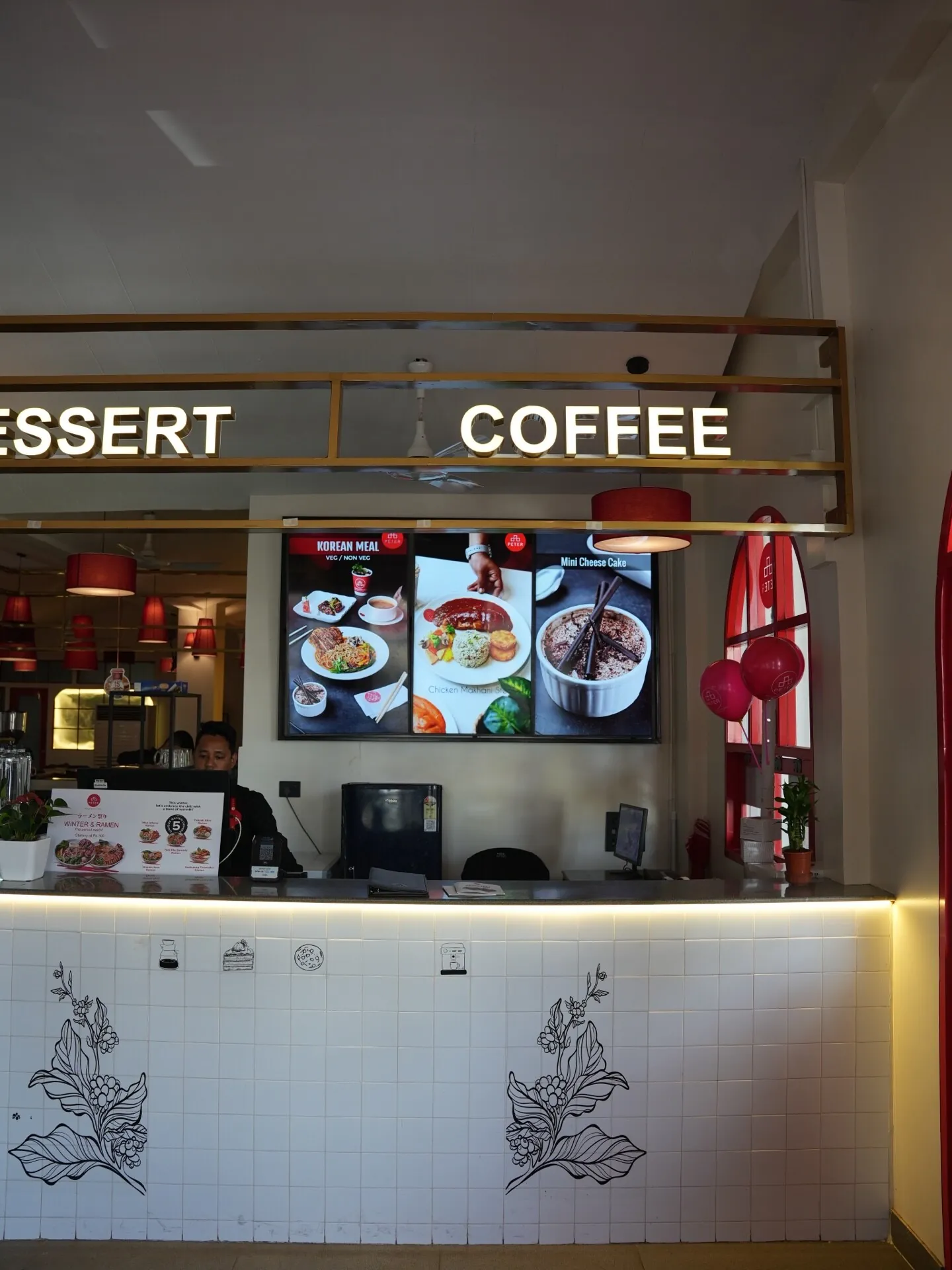
The seating is arranged as a collection of practical conditions rather than one undifferentiated room. Tables and dining chairs fill the main area. The curved sofa provides a different edge within an arched bay. The service counter and display area face into the room, so the operational heart of the cafe remains visually connected to the seating.
This relationship is legible in the photographs: the visitor can understand where to enter, where the cafe activity is concentrated, and where to sit. The counter is not hidden behind a separate visual treatment, and the seating is not pushed into leftover corners. The room reads as one compact plan in which arrival, ordering, and dining belong to the same sequence.
What this project shows about cafe interior design in Pune
Café Peter shows how a Pune cafe can establish a strong identity through a small number of visible decisions. The project does not need a long list of unrelated finishes to be recognisable. Red-framed arches carry the visual language; warm pendants, planting, and furniture give that language atmosphere and use.
For hospitality interiors, the useful principle is not to copy the arch or the colour. It is to let one clear spatial idea organise the relationship between the street, the room, the seating, and the counter. When those parts speak to one another, a compact cafe can feel deliberate, memorable, and complete without being visually overloaded.
Project facts
Project: Café Peter, Erandwane Location: Erandwane, Pune Type: Hospitality Studio: prāngaṇa Lead designer: Rohit Pasalkar
Planning for everyday café life
The brief brings seating, circulation, lighting and service into the same conversation. At Erandwane, tables beside the arched windows, upholstered seating bays and a visible counter give these needs a clear spatial setting.
Warm light and a consistent red accent connect those areas. The intention is to make the café comfortable for a short visit or a longer conversation, while keeping its everyday service activity part of the room.
Design and project account: prāngaṇa · Rohit Pasalkar
Frequently asked questions
Where is Café Peter located?
Café Peter is located in Erandwane, Pune.
Which visible design elements define the interior?
The interior is defined by red-framed arched windows and openings, warm pendant lights with red shades, upper-wall planting, compact dining and sofa seating, and a service counter with display.
Who designed Café Peter, Erandwane?
Café Peter, Erandwane was designed by Rohit Pasalkar through prāngaṇa studio.
Read Rohit Pasalkar’s reflection on repetition, memory, and the arch at Café Peter.
Working on a hospitality interior?
We work with café and restaurant owners who care about how a space feels.