Purnabramha
Maharashtrian roots. A contemporary welcome.
A Maharashtrian reference, a contemporary welcome
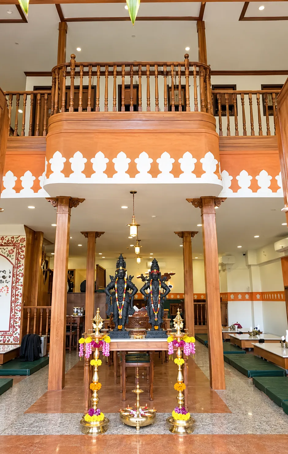
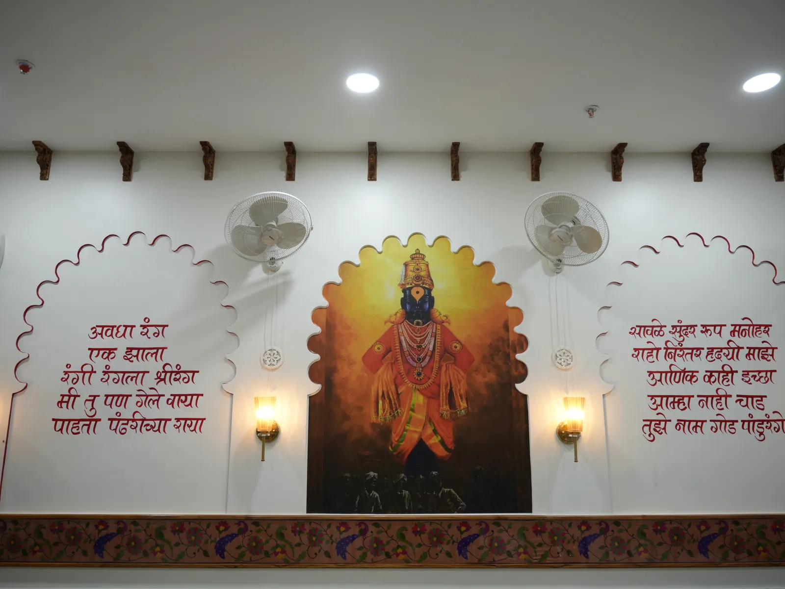
Purnabramha's design direction begins with the material warmth of Maharashtrian homes and craftsmanship. The aim is not to reproduce an older house as restaurant scenery, but to bring a sense of place into a setting shaped for gathering today. Familiar materials give the room a rooted starting point, while a contemporary language keeps the composition clear.
The owner's brief connects wood, earthy textures, warm light and Wada-inspired details. We consider these as related choices: architectural references establish character, surfaces bring a tactile register, and lighting helps those layers sit comfortably together. The story describes that design intent, without assigning an unconfirmed site history or location.
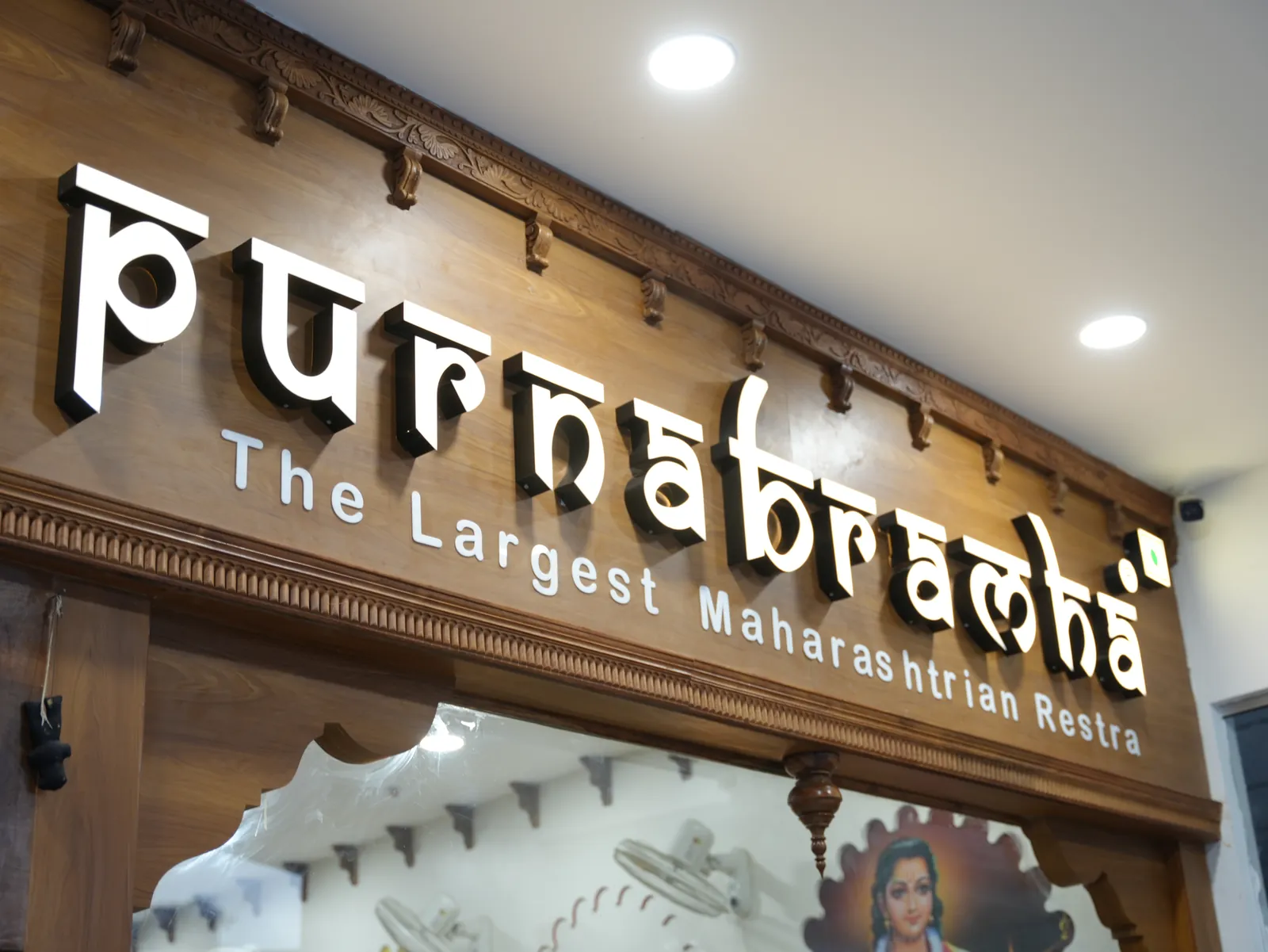
Wada-inspired details without literal reconstruction
Wada-inspired architectural details give the concept its sense of familiarity. Here, inspiration is a direction for proportion, detail and the relationship between elements, not a claim of a restored heritage building or an actual courtyard. The reference is translated through the interior's contemporary setting rather than treated as a complete historic template.
This distinction leaves room for restraint. A recognisable architectural language can give the room coherence without requiring every surface to repeat it. Quieter areas are part of the approach too: they allow the more expressive details to remain legible and keep the dining environment welcoming rather than visually crowded.
Wood, earthy texture and measured brass
Natural wood forms a warm material foundation. Earthy textures add another scale of detail, so the palette is experienced through both grain and surface rather than colour alone. The intention is a tactile setting in which materials contribute character without competing for attention.
Brass accents and handcrafted elements are used as measured additions to that foundation. Brass offers contrast to the quieter browns and beige, while handcraft introduces detail that rewards a closer look. Their role is to add depth, not to turn every object into a focal point. No timber species, named maker or particular commissioning history is established by the brief.
A palette with room for quieter moments
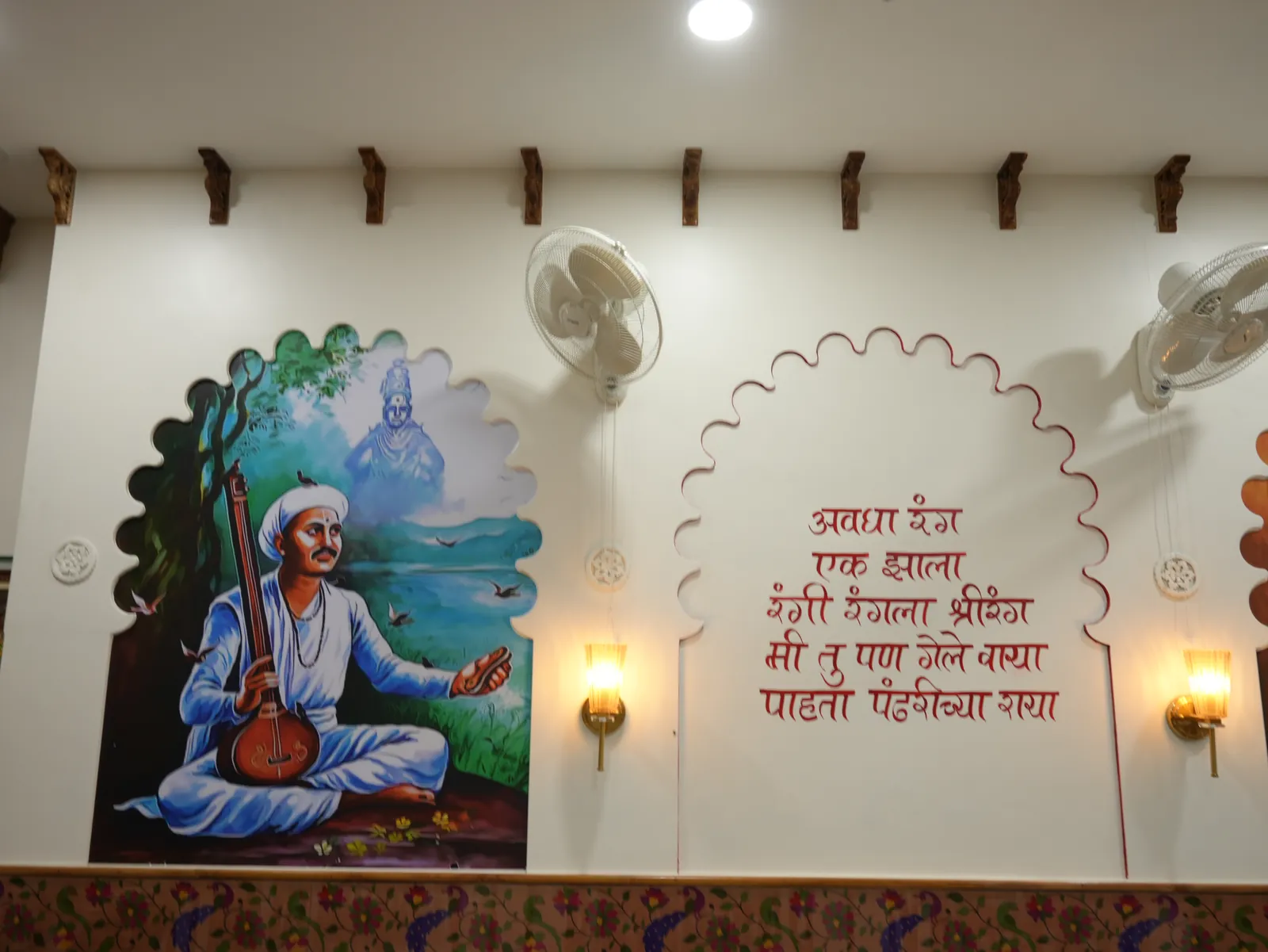
The palette moves through earthy browns, natural wood and warm beige. Together, these tones give the design a continuous base; the room does not need a sharp change of colour at every element to express its identity. Texture can do some of that work, keeping the overall composition warm but composed.
Muted greens introduce a quieter counterpoint, while measured touches of saffron provide an accent. The intention is a balance between familiarity and freshness. Green and saffron are not asked to dominate the material palette; they sit within it, allowing wood, handcrafted detail and the architectural references to retain their distinct roles.
Warm light as part of the material language
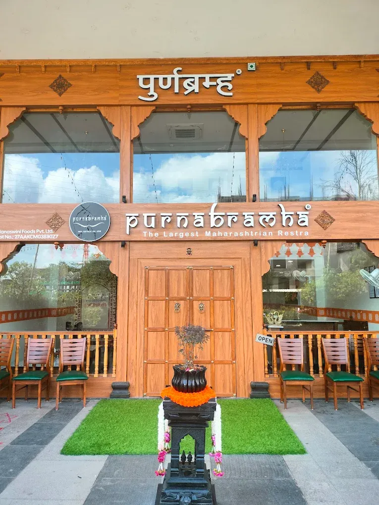
Warm lighting is considered alongside the materials, not as a finishing layer added after them. Its intended role is to bring the grain of wood, the depth of earthy surfaces and the restrained brass accents into a shared atmosphere. A material choice is read differently depending on the light around it.
For the studio, that relationship is also a matter of hierarchy. The design direction favours a welcoming room over a collection of isolated statements. Light can support that intention by connecting quieter surfaces and crafted details, without claiming particular fixture specifications, measured illumination levels or an unverified lighting installation.
Craft, comfort and conversation
The intended dining experience feels connected to Maharashtra and at ease in the present. Architectural references establish a sense of place; the palette and tactile materials bring warmth; brass, patterns and handcraft provide detail at a more intimate scale. Their value lies in how they work together rather than in any one material standing for the whole concept.
Gathering remains the organising purpose. The direction is for a restaurant where character supports the time people spend together, instead of overwhelming it. This is an account of the owner's supplied design brief and the studio's intended relationships between choices, not a claim about measured guest responses or business results.
Design and project account: prāngaṇa
Frequently asked questions
Does the project recreate a Wada?
The brief uses Wada-inspired details as a contemporary design direction. It does not establish an actual courtyard, a historic building or a restoration project.
Read Rohit Pasalkar’s reflection on arrival, visual anchors, and neighbourhood cafes.
Working on a hospitality interior?
We work with café and restaurant owners who care about how a space feels.